Why I didn’t like the new Madhouse Iron Man teaser
During the recent San Diego Comic-Con Marvel unveiled a teaser for their new anime-style Iron Man series coming to G4 in 2011.
I’m sorry but I didn’t like it.
For starters Tony looks fat, as in “his face is too goddamn round.”
Then there’s the animation. What the hell happened to that glorious presentation Madhouse released last year? This doesn’t really look like Madhouse at all. Did Marvel offer less money and they decided to go for cheap-looking CG?
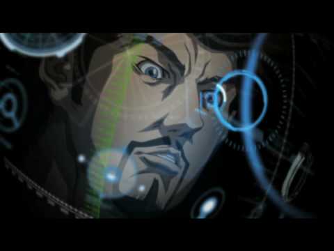
This is the video they showed last year:
That was fantastic! What happened, were the animators kidnapped by a group of ninjas wearing fluorescent orange suits and metallic bandannas?
The new video looks a lot like the 3D Iron Man series currently running on Nick.
So, what’s the story here? Did Disney order Marvel to keep the funding to a minimum? I don’t know what’s going on, but whatever it is I hope they released a work in progress and the final version looks way better than this, otherwise I’m staying away from it.