
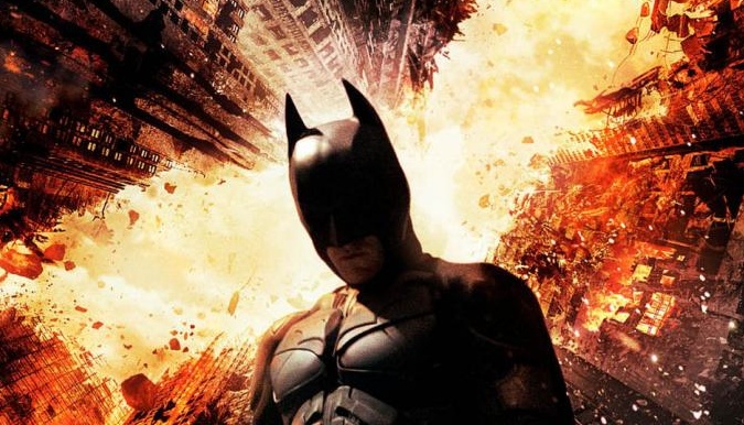
A new “Dark Knight Rises” poster is out and everybody hates it
Is it good? Is it bad? You be the judge.
I spent about an hour reading complaints from a few websites, including reddit, I really have to agree that everybody expected something a lot more spectacular.
To be honest I was expecting something different. It’s not bad, but it doesn’t look that good either, in fact, it kind of looks like something I would’ve done in Photoshop, it doesn’t look like a pro did it…
I think it would look better if Batman wasn’t there, it just looks too saturated. Also, it looks really bad that Batman is standing like that and facing that way when the buildings are shown from a whole different angle.
Redditor etched posted this animated gif that shows how simple it is to come up with something like this in Photoshop (click here if the image below doesn’t work):

I could go on and on about how bad this looks, but the bottom line is it looks like a rushed job. Personally I liked the Bane poster a whole lot better, but that’s just me.
[via]


One Comment
Pingback:New “Dark Knight Rises” character posters to make us happy | RETROhelix