RoboCop’s first poster is out – Not terribly bad, but not great either

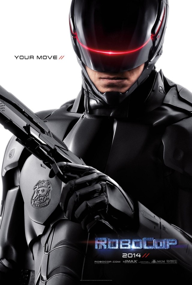
Columbia Pictures and MGM have revealed the poster for Jose Padilha’s upcoming RoboCop reboot.
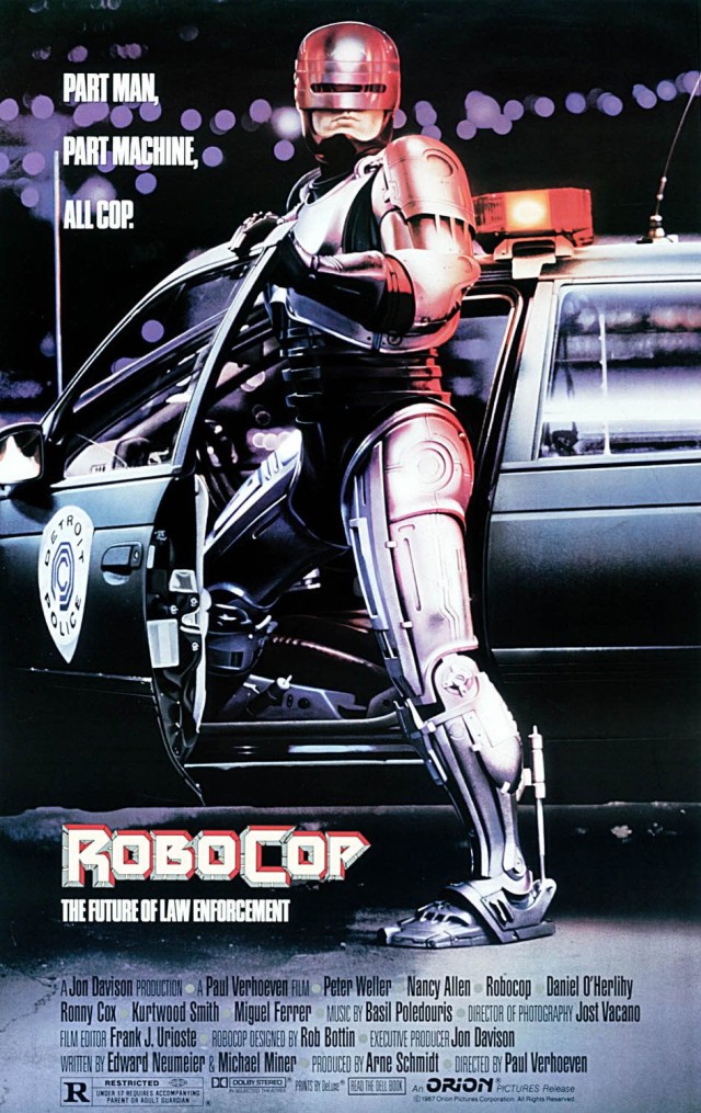
Let me tell you right away that, while this poster is not horribly bad, it lacks everything the poster for the 1987 release of RoboCop had.
YOUR MOVE //
From all the possible quotes they went with that? What is this, “Yu-Gi-Oh!”? The poster is pretty bland, it doesn’t have the menacing effect the old 1987 poster had. Also, I don’t know if they were going for a “minimalistic” approach, but using 80% of the space on a white background doesn’t really count as minimalistic…
Here’s the old poster in all its glory:
You see that? A full body shot of the motherflippin robot, now that’s good stuff, and look at all the quotes they could’ve used:
“Part Man. Part Machine. All Cop.”
“The Future of Law Enforcement”
“Bitches, Leave!”
OK, maybe the last one is not appropriate, but come on, how come posters lately have been so bad? They spend millions on advertising, yet the posters are bland/crappy Photoshop jobs, kinda makes me wonder if they use unpaid interns to edit them on the fly.

