Iron Man 2 new poster – really???
The latest Iron Man 2 poster came out a couple of days ago, and I gotta say it’s kinda ugly.
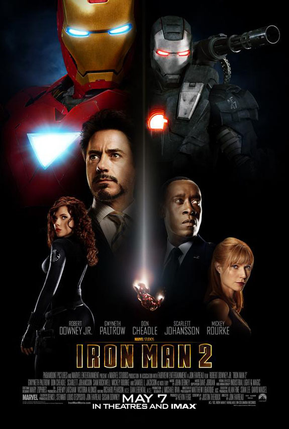
It’s not horrible, but it’s not good either, in my eyes the way they used the 2 armors is just wrong, and the little Iron Man flying down in the middle is hardly noticeable at first, I’m sure they could have done better, I’m no designer but I think there are better ways to position everything without it looking like, well, like this.
On the same note, Scarlett Johansson’s poster came out pretty good >:3.
What is your reaction?
0
Excited
0
Happy
0
In Love
0
Not Sure
0
Silly


