
The 2 official posters for Marvel’s “Thor” look awful
I don’t know what Paramount was thinking when they released these 2 posters, but they look too amateurish.
I am not saying I can come up with something better, but that’s the whole deal, these look like something I would have put together.
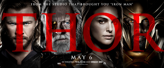
First we have this banner. Look at the letters that form the name “Thor.” Did I come up with that? ‘Cause that sure as hell looks like something an amateur like me would have come up with…
Now we have the red poster.

Why red? Is this a slasher movie? And why in heaven’s name did they ignore the current comic font and went instead with something so generic?

That’s the font I’m talking about….If that’s the best Paramount can come up with I’d better apply for a job with them….
What is your reaction?
0
Excited
0
Happy
0
In Love
0
Not Sure
0
Silly


[…] looks alright so far. I kinda want to see the new posters already, they messed up the posters for the last Thor movie real bad, so I wonder if they’ll do something better or […]
Deberías, los posters mejorarían al menos
jajaja siendo realista creo que si me pude haber inventado algo mejor :3