the new youtube layout sucks
 Just who the hell designed that nightmare, me? The change was unnecessary, I even thought it was an April Fool’s prank….
This is basically what I don’t like:
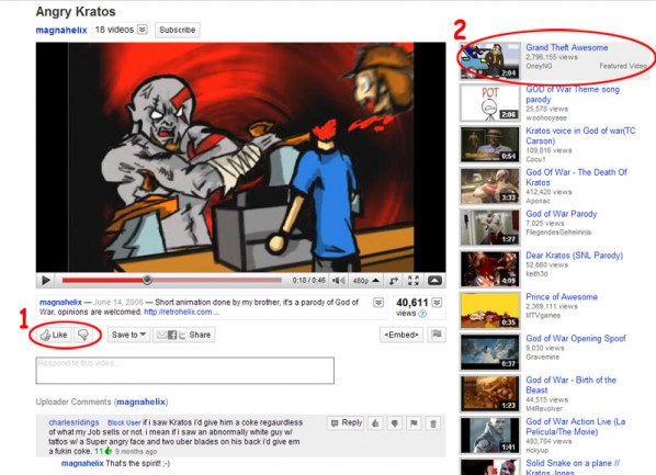
- You don’t get to choose how many stars a video is worth, now it’s either you like it or you don’t.
- The description has been moved to about under the video, while that is not entirely bad now you will have to scroll down to read the description, and you will notice that in some videos the space where the description used to be now is used for “suggested for you” (as in the front page) or a “featured” videos. Oh and the “related videos” column looks a bit crowded in my opinion.

As you can see now you have to click on the “save to” button to get the “favorite” option, now my problem with it is the unnecessary extra step to click a button to get something that was just there before, and I’m sure a lot of people will have problems trying to find the darn “favorite” option, how did they come up with the idea to move it under something called “save to,” that to me sounds like “save to my computer” and not “save to my favorites”, that’s just dumb.
Now this is something they should have left alone, now to get the YouTube link to any video you have to click on the “share” button, weirdly enough they left the “embed” option visible outside the share option, to me they either display both under the same option or in plain sight, there was no need to make this overly complicated.
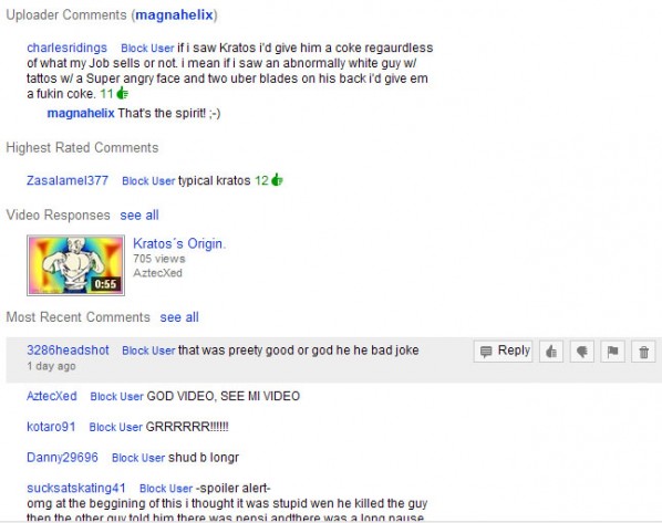
Now my biggest no-no; the comments.
That’s plain ugly, why are the video responses that far down the page? And why take the time to screw everything up? Are they trying to appeal more to mobile devices? If that’s the case then they succeded, but for us using our computers to access the site it’s pretty bad and overly complicated.
For some reason I think they tried to copy Dailymotion’s setup, which is a better looking version of what Youtube just implemented…
Just take a look at the angry mob in Google’s support forum, a lot of people want the old page look back, specially the stars rating, if Google thinks this looks innovative they fail miserably.



Tampoco me gustaron los cambios. Ahora hay cosas que no sé dónde quedaron.
Saludos
.-= Sara´s last blog ..Frase sabia del día: las rebecas =-.
hay cosas que no debieron tocar, no era necesario pero bueno, creo que lo hicieron para hacerle la vida facil a los que entran a youtube usando celulares y similares, especialmente coincide con la salida oficial de la iPad a la venta…..